NIKE EMEA 总部园区位于希尔弗瑟姆商业园的中心,该园区正在变成一个为耐克运动员(员工)和参观者提供工作和体验的园区。这个公共空间在其中起着至关重要的作用。受乌特勒支岭国家公园丰富自然景色的启发,它正在发展成一个充满运动和休闲活动的景观园区。
The NIKE EMEA headquarters campus, located in the heart of thebusiness park in Hilversum, is being transformed into a work and experience campus for NIKE athletes (employees) and visitors alike. The public space plays a crucial role in this. Inspired by the rich nature of the Utrechtse Heuvelrug, the campus is being developed into a landscape campus full of sports and leisure activities.


▲项目外观概览,appearance of the project
耐克正在彻底翻修园区总部,对个别建筑进行升级。这样它将发展成为一个开放、热情的园区,希尔弗瑟姆的居民也可以从中受益。耐克园区拥有来自80多个国家的 3,700 多名员工,它将成为一个充满活力、工作场所,这也体现了耐克的雄心壮志。
NIKE is thoroughly renovating the Campus Headquarters, with individual buildings being upgraded. In this way, the NIKE campus will develop into an open, welcoming campus from which residents of Hilversum can also benefit. With more than 3,700 employees from over 80 countries, the NIKE campus becomes a dynamic, energetic workplace, reflecting NIKEs ambitions.

▲由周边环境看建筑,viewing the project from surrounding environmen
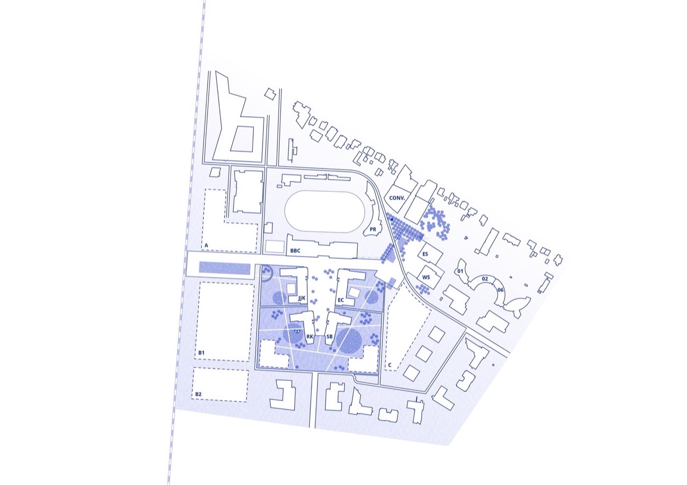
从 2020 年起,B+B 城市规划和景观建筑局正在着手改造 NIKE EMEA 园区。随着附近的体育公园火车站未来将搬迁到 Arena 商业园,该园区将进行重组。未来的林荫大道将连接东西校区以及三个新广场。
From 2020 onwards, Bureau B+B urbanism and landscape architecture are working on the transformation of the NIKE EMEA campus.With the future relocation of the nearby train station called Sports park to the Arena business park, the entire campus will be restructured. The future boulevard which will connect the east and west campus as well as three new squares.


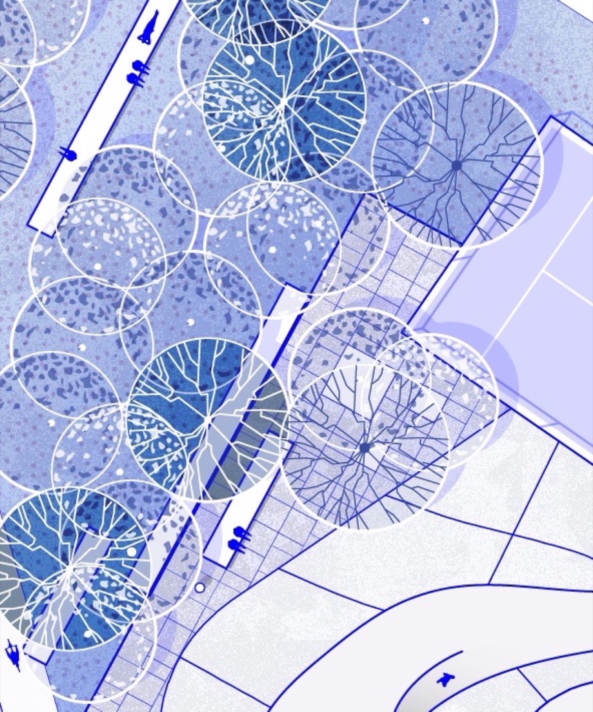
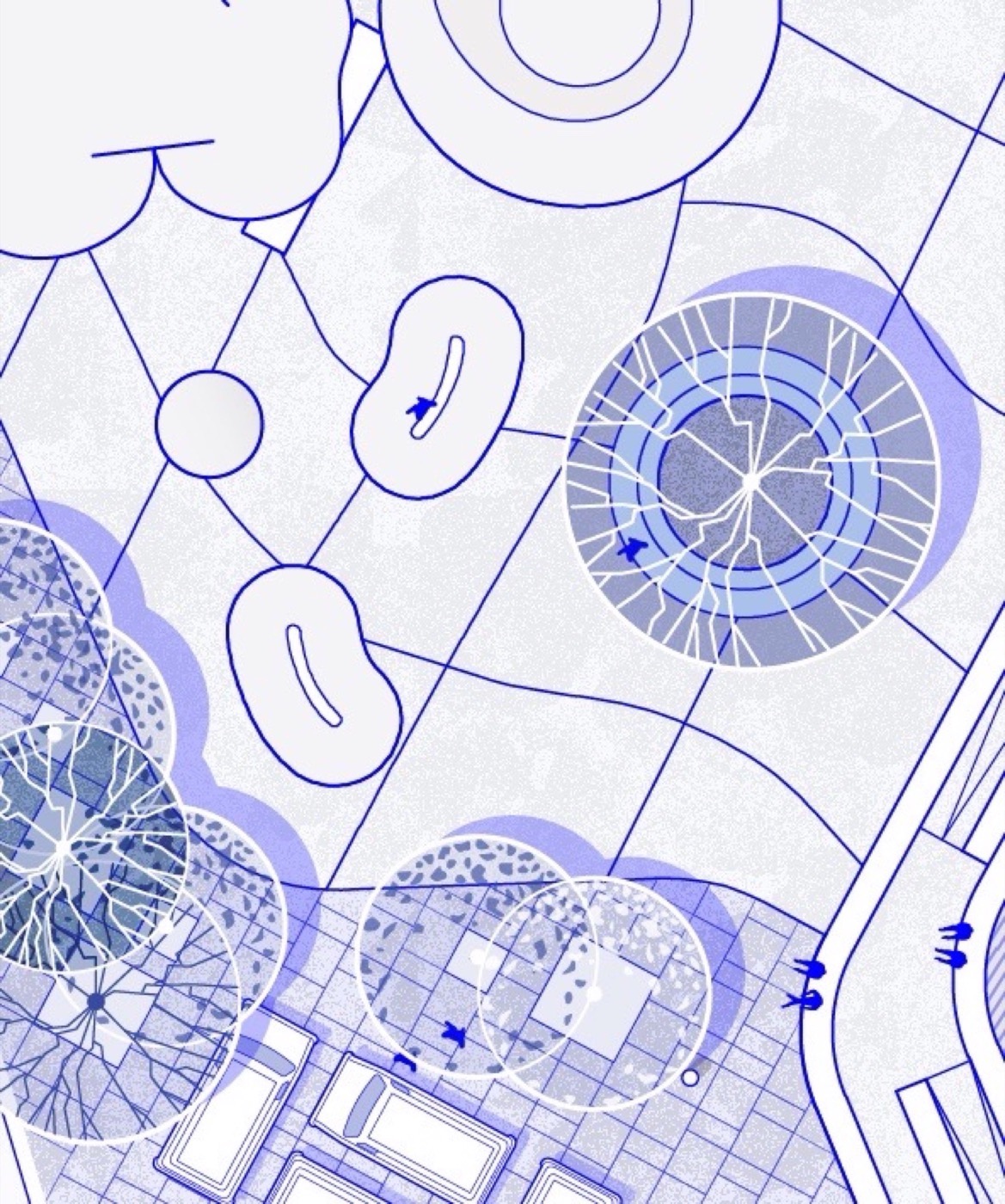
▲场地平面图,Site plan
混色区域中的森林 |a forest in the heather fields
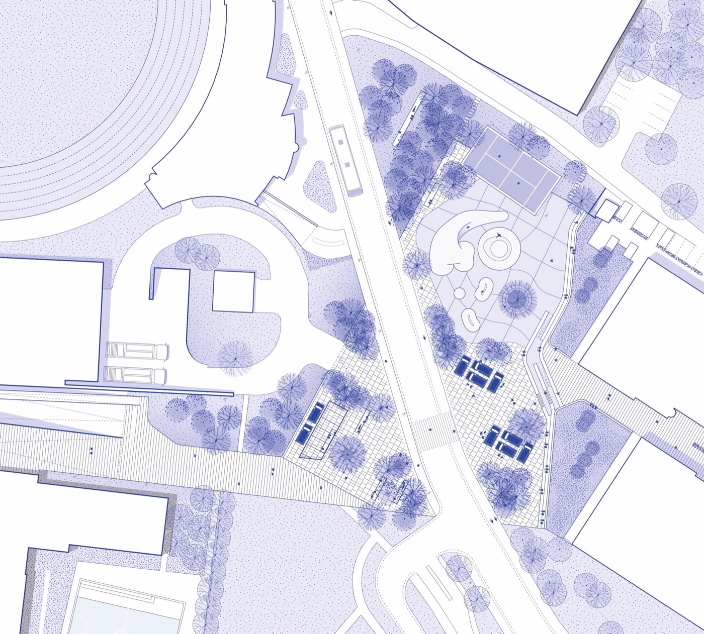
Homecourt是作为新园区的一部分,是建成的第一个广场。它最初是校园内的一块空地,其特点是许多建筑物的背面和不清晰的路线。Homecourt的设计重点是在园区内创造一个以食物和滑板作为主要活动的新目标。
Homecourt is the first square that was completed as part of the new campus. The location originally was a bare and vacant lot on the campus that was characterized by the many backs of buildings and unclear routing. The design for Homecourt focuses on creating a new destination on campus with food and skate as the main activities.


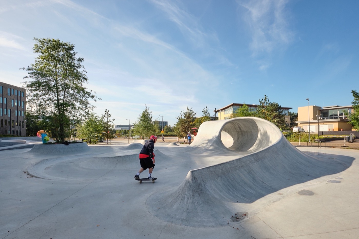
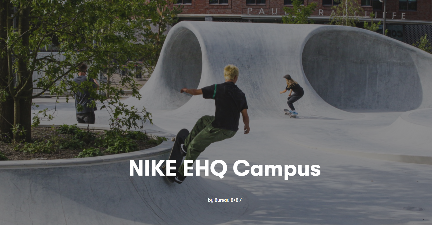
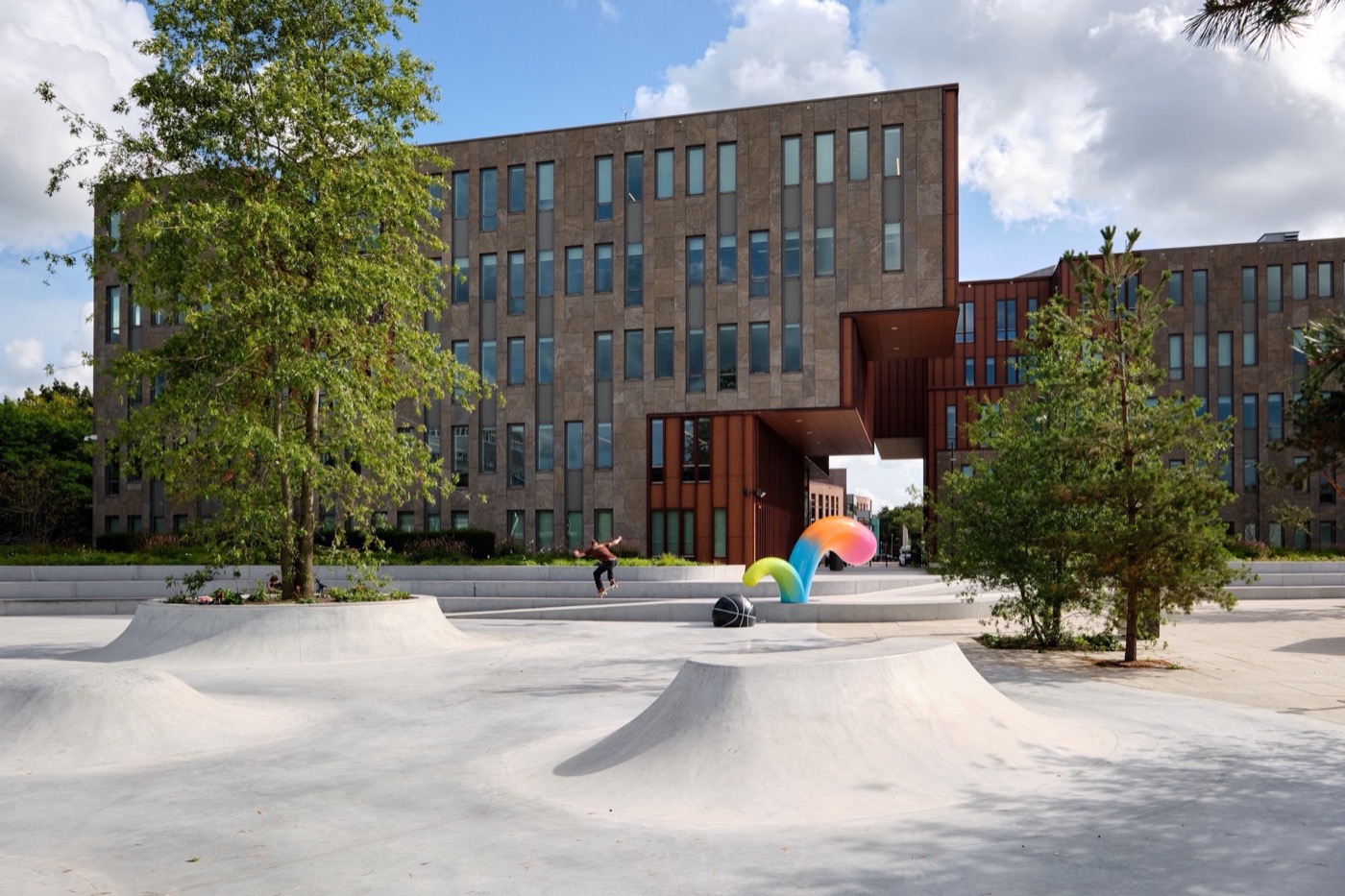
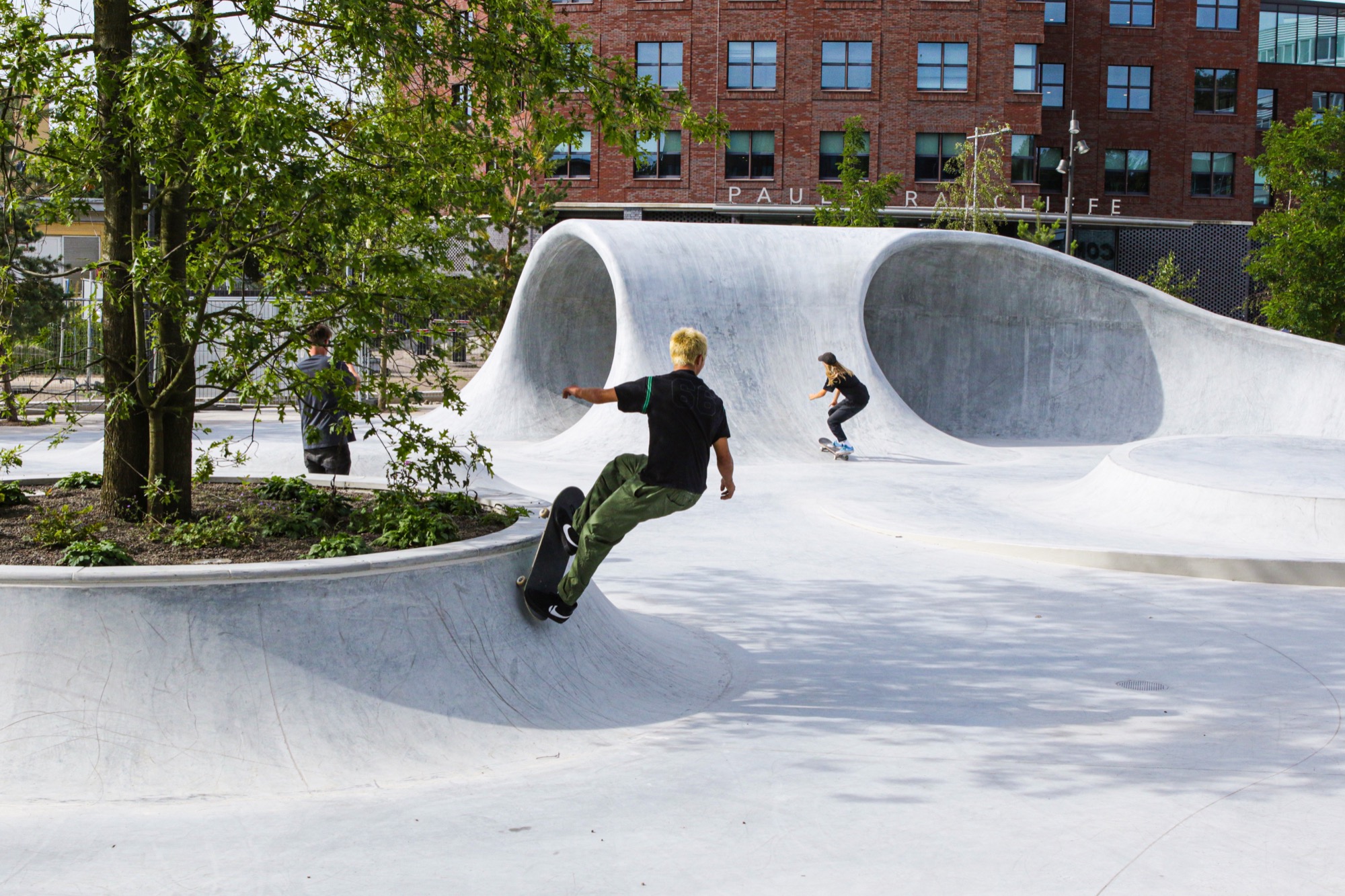
▲滑冰区skate area
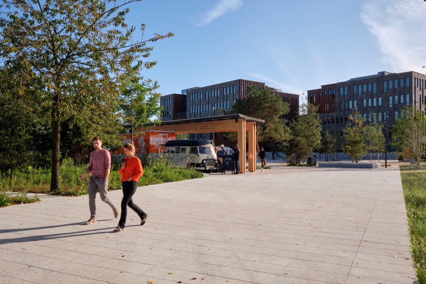
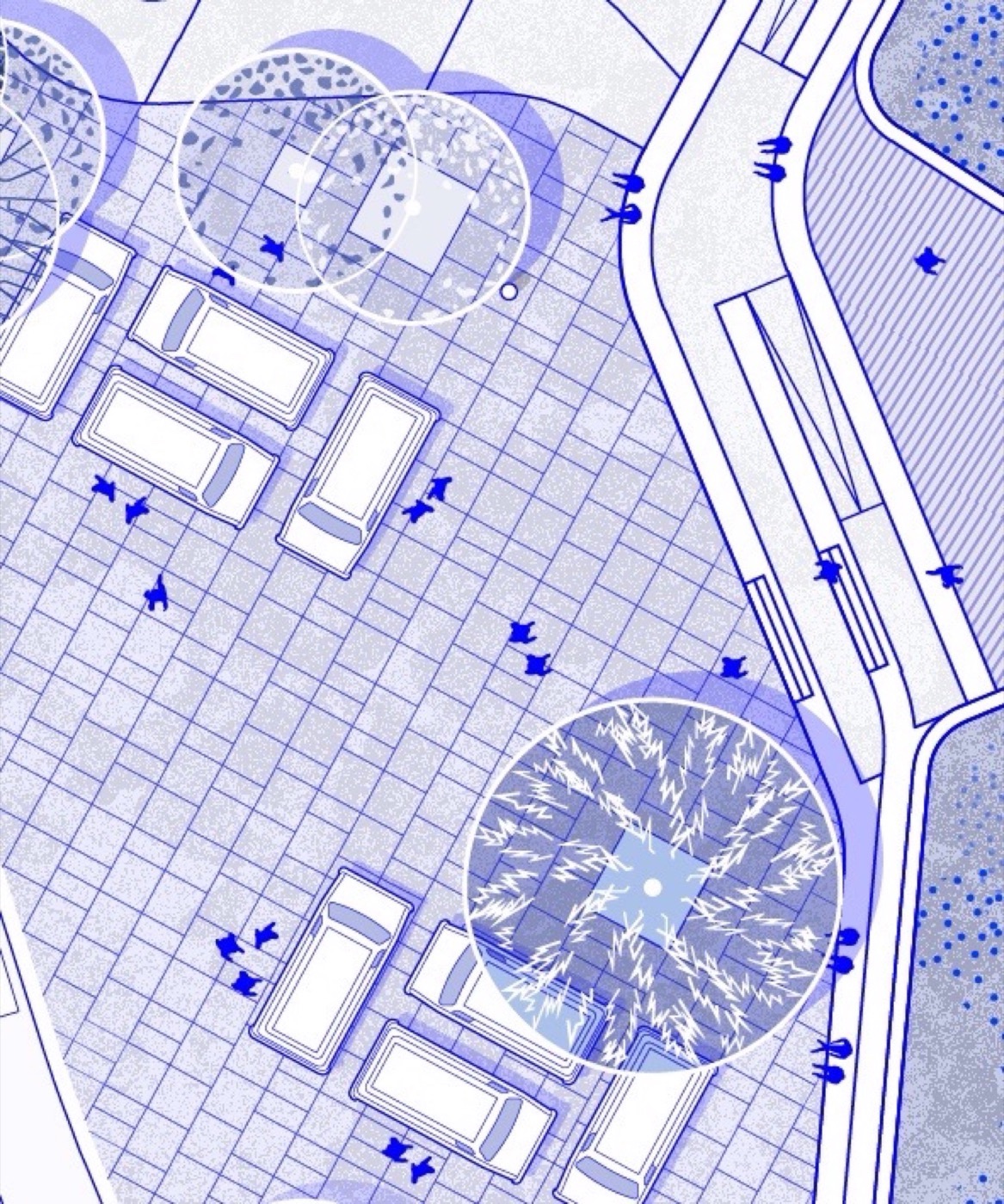
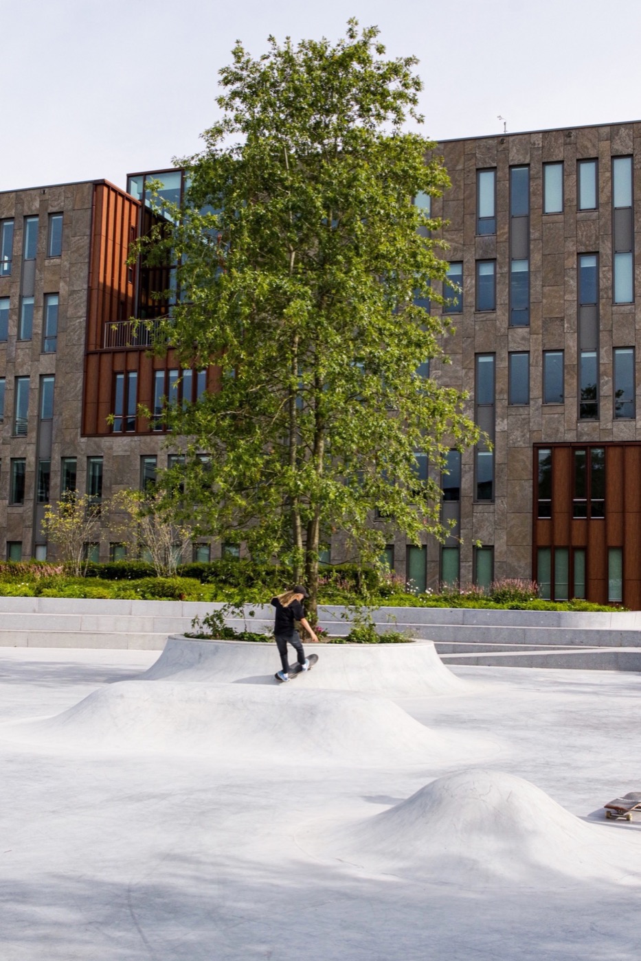
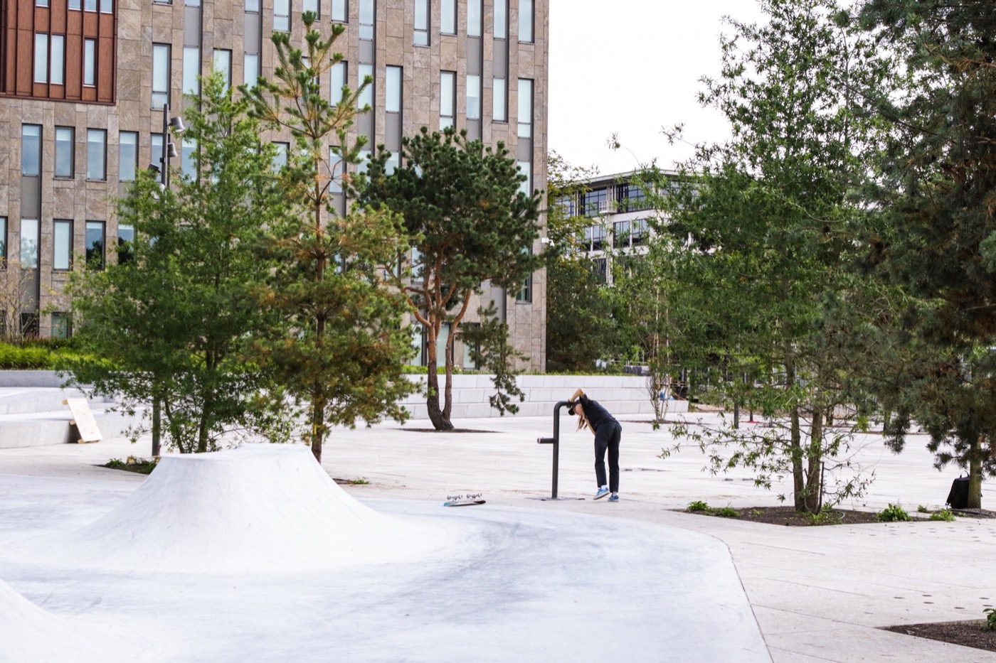
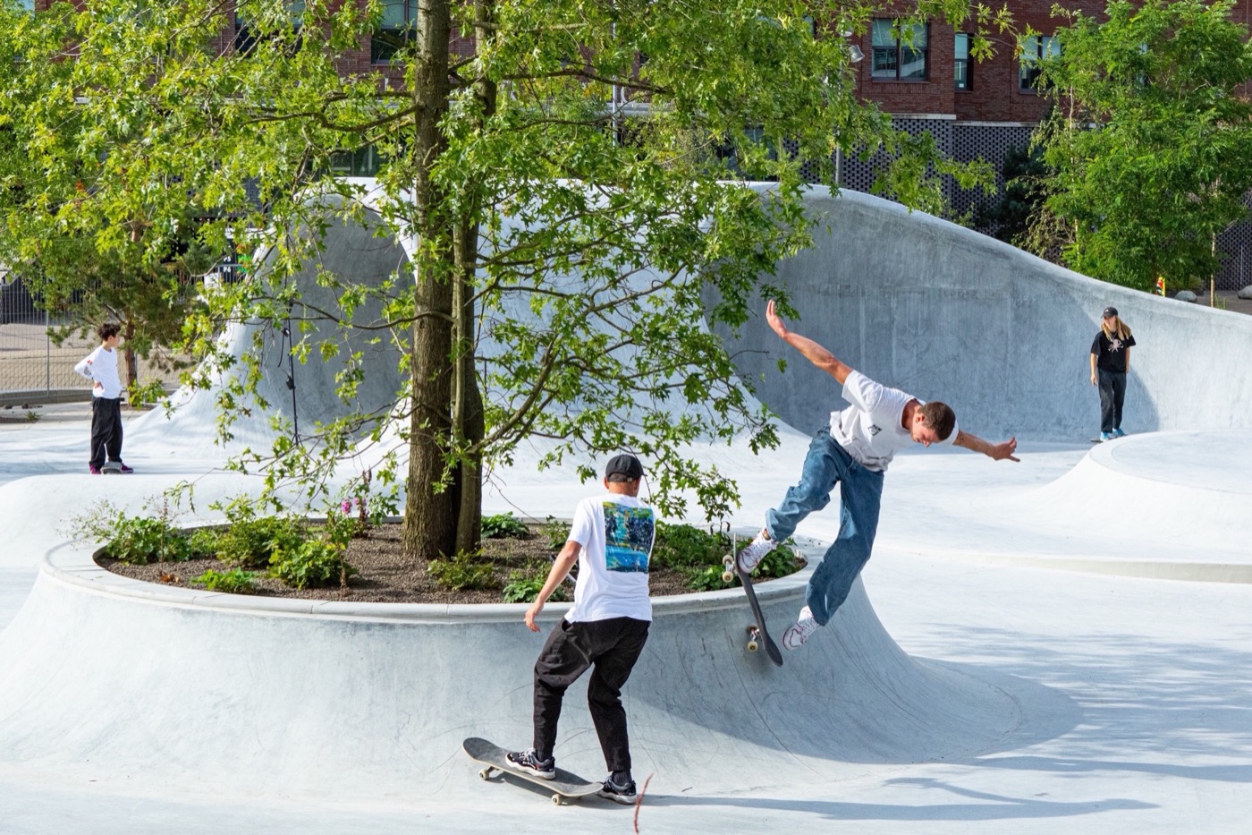
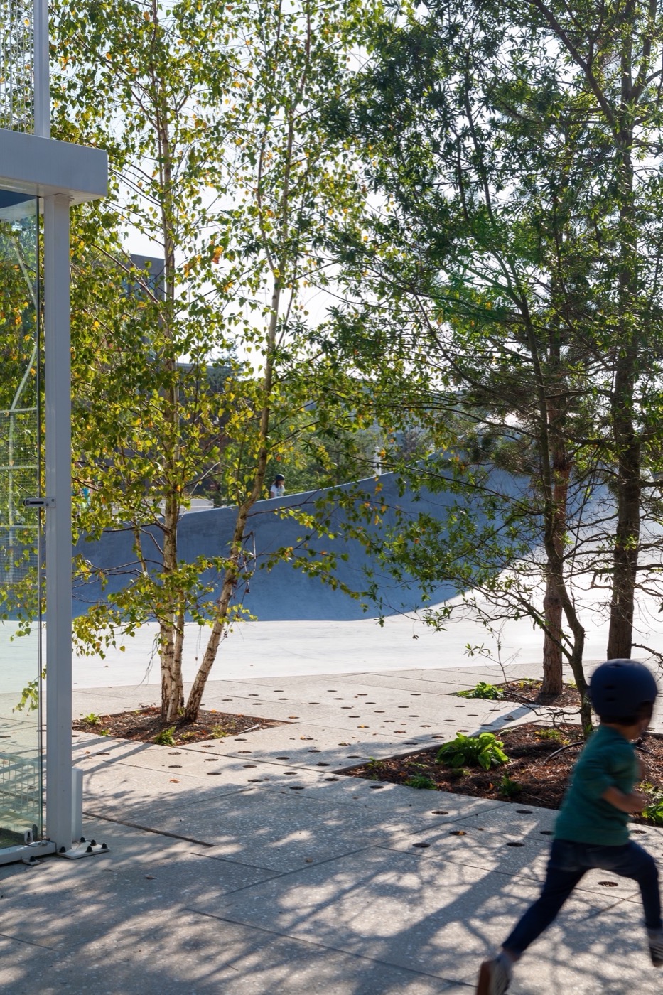
广场被设计为混色区域中的森林从远处可以看到,但从里面看是隐蔽和宜人的。广场上有一个专用滑冰区一种抽象的波浪,它是主要的引人注目的地方。该广场还有快餐车空间。员工可以在这里享用下午的午餐,然后在树荫下享用。
The square is designed as a forest in the heather fields- visible from afar, and sheltered and pleasant from the inside. In the square is a dedicated skate area an abstracted wave being the main eye-catcher. On the square, there is also space for food trucks. Here employees can get their lunch in the afternoon and eat it in the shade of the trees.
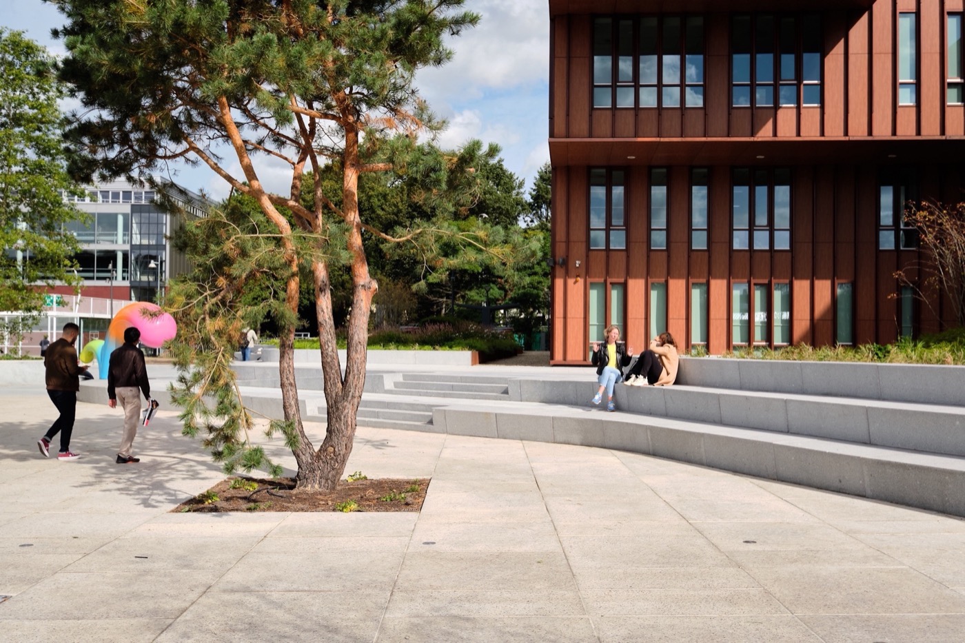
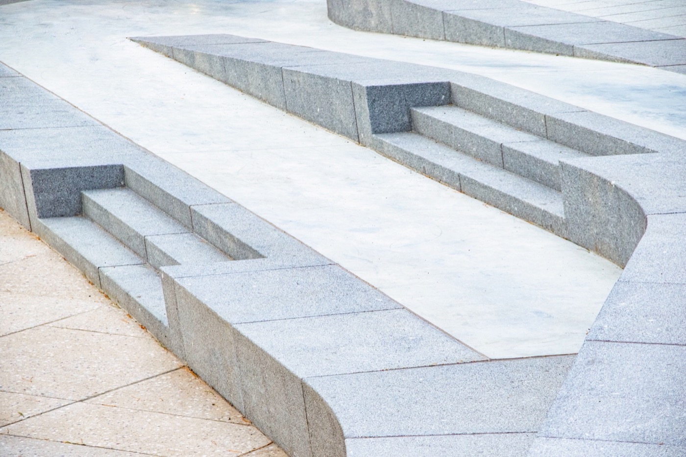
最重要的是,Homecourt 是社交聚会场所,无论老少,运动与否。广场和园区东侧之间的高度差由一个引人注目的楼梯连接起来,它可以用作座位区、楼梯和溜冰场。
Above all, Homecourt is a meeting place for the community, old and young, sporty or not. The difference in height between the square and the east side of campus is bridged by an eye-catching staircase, which can be used as a seating area, stairs and skate spot.


▲广场,square
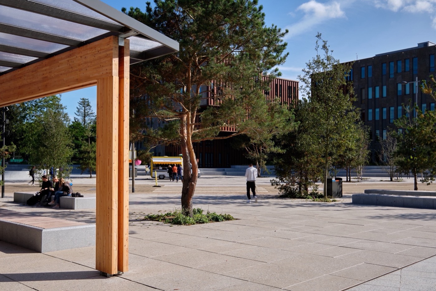
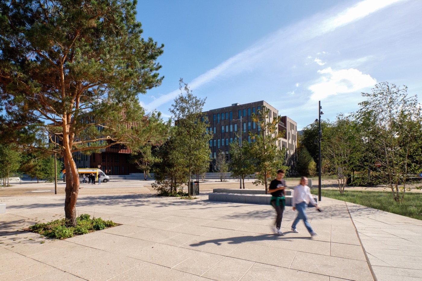
广场上的所有物品和材料都经过精心设计,这样方便滑行。大幅面瓷砖在尺寸和组成上是独一无二的;颜色和鹅卵石使广场看起来像沙质,与该地区的地质相匹配。Homecourt 及其周边地区种植了 90 多棵不同类型、大小的树。这些树被种植的很近,这样它们就可以成群生长。两棵松树和一棵位于滑冰区中心的栎树在广场上充当着引人注目的角色。
All objects and materials on the square are designed in such a way that they can be skated optimally. The large format tiles are unique in size and composition; the colour and pebbles give a sandy look to the square, matching the geology of the area. More than 90 trees have been planted in and around Homecourt in various types and ,sizes. The trees are planted close together so that they can grow as groups. two pine trees and a Quercus palustris located in the heart of the skate area act as eye-catchers on the square.

▲户外硬景观细节,Hard landscape details
▲Homecourt 及其周边地区种植树,trees have been planted in and around Homecourt
挑战 | Challenge
该项目最大的挑战是几乎所有周围的建筑物都背对着场地。设计师利用树木创造新的边界并定义了这个地方。这样,未来的林荫大道和广场都将是没有车辆的。设施区的入口也已搬迁,并完全融入广,这为新广场上的行人提供了充足的空间,并使其成为园区用户和当地社区的优质的聚会场所。
The biggest challenge of the location was that almost all the surrounding buildings turned with their backs to the site. Creating new borders by means of trees creates shelter and defines the place. The square has been cleared of car traffic. the future boulevard and the square will be car-free. The entrance to the facility area has also been relocated and fully integrated into the square. This gives pedestrians plenty of space on the new square, which has become a high-quality meeting spot for the users of campus as well as for the local community.
▲项目外观概览,appearance of the project
项目信息
景观设计师:B+B 城市规划局
参与设计的建筑事务所:室内建筑师(树冠),F31(滑板设计师),Ruben Sanchez(艺术家)
项目地点:1号罗马圆形大剧场,1213 NL希尔弗瑟姆,荷兰
设计年份:2020/2021
建造年份:2021
Landscape architect:Bureau B+B urbanism
Architecture offices involved in the design: Inhouse architects (canopy), F31 (Skatedesigner), Ruben Sanchez (artist)
Project location: Colosseum 1, 1213 NL Hilversum, the Netherlands
Design year: 2020/2021
Year Built: 2021
素材来自landezine

